PRACTICAL ANIMATION GUIDE / 2026
SaaS Empty State Animation: What to Show Before the First Result
A useful SaaS empty state explains why a screen has no content and gives the visitor a relevant next action. Animation can make that explanation easier to notice, but the heading, supporting text and button must work without it. Start by distinguishing a new account, an empty search, unavailable data and an error. Those situations should not receive the same cheerful illustration or instruction.
1. Separate no data, no results and errors
“Nothing here yet” may describe several very different product conditions. A new account has no records because nobody has created one. A filtered view may have records elsewhere but none matching the current filters. A disconnected source cannot supply data. A failed request may have no reliable result to show. Before drawing anything, ask which of those conditions the product can identify and what the person can do about it.
Create an inventory of empty screens with the product owner. For each screen, record the trigger, known cause, audience and next action. Include the difference between a person who can create content and a read-only colleague who cannot. An invitation to “Create your first project” is unhelpful when the viewer lacks permission. The motion brief should reflect the same permissions and actual features as the surrounding application.
| Situation | What needs explaining | Possible next action | Motion direction to discuss |
|---|---|---|---|
| New account | No content has been created | Create or import an item | A restrained introduction |
| Empty search | No items match the current request | Edit the query or clear filters | A brief search-related gesture |
| Disconnected source | Information is not connected | Connect an approved source | A connection illustration |
| Failed request | The requested data was not retrieved | Retry or review help | Clear static recovery feedback |
| Completed queue | No remaining tasks are waiting | Return to the overview | A small completion acknowledgement |
This matrix is a proposed design aid, not a list of implemented features in a named client product. Validate every row against the actual application. If the backend cannot distinguish failure from an empty result, the product needs a clearer state model before the illustration can communicate the difference reliably.
2. Give the next action priority
Write the heading and button label before commissioning motion. A good heading establishes the situation. The supporting sentence explains the next step or why no action is needed. The button names the action that the application really offers. When these pieces are clear, the animation has a specific communication role. It does not need to compensate for vague copy or a missing product decision.
Keep the main control outside the animation file. The normal interface should own its label, focus behavior, permissions and click handling. If an animated pointer or character gestures toward the control, check that the gesture still makes sense when the layout changes. A desktop composition can accidentally point away from the button on a narrow screen. Review the small layout with the actual copy rather than a short placeholder.
Avoid making the visitor wait for an entrance sequence to finish before acting. An experienced user may already understand the state. The animation should not turn an empty table into an obstacle course. Make the action available immediately and decide what happens if the person clicks while the visual is playing. The application state should lead; the decorative sequence can stop or leave gracefully.
Sometimes the correct next action is no action. A completed queue can simply acknowledge that work is done. A shared dashboard awaiting another team member may need an explanation, not a prominent button. Design the state around the user’s responsibility. Adding a CTA everywhere can make the product feel less clear if the person cannot meaningfully change the situation.
3. Choose one meaningful motion
Pick a gesture that supports the explanation. A small reveal can introduce a first-use state. A search-related movement can support an empty results screen. A character greeting may fit a welcoming brand. Avoid combining every available visual idea simply because the empty space is large. The composition should leave room for the instructions and remain understandable after the first impression.
Use the three original studio references below as motion-direction examples. The research-related UI preview suggests a search context, the data-card preview suggests structured information, and the waving character suggests a welcome. They are not presented as completed empty-state implementations or attributed to an invented client engagement. Their usefulness here is in discussing style, scale and the relationship between illustration and interface.
Decide whether the gesture plays once, repeats with a pause or remains still after an introduction. Review repetition while reading the surrounding text, not only while watching the animation in isolation. A movement that feels pleasant once may compete with concentration when repeated beside a form. Include the chosen resting frame in the approval so the final state is intentional.
Specify the relationship between success and emptiness. A queue with no remaining tasks can be a positive result; an account without imported data is a starting condition. Reusing the same success checkmark for both can imply that setup is complete when it is not. Ask what conclusion a first-time viewer should draw from the visual and make the motion consistent with that conclusion.
4. Keep the fallback useful
Approve a static version alongside the animation. It should preserve the same explanation and next action when the animation cannot load or when reduced motion is preferred. A poster without the moving flourish may be enough. The important point is that the visitor does not lose instructions, data or the ability to continue. The fallback is part of the interface, not an afterthought for an exceptional browser.
Reserve the visual’s dimensions and review long copy. Empty-state text is often translated or customized for different account types. A compact English sentence is not evidence that the composition will fit every language. Give the developer layout guidance rather than baking instructions into the animation. If a locale needs different artwork, include that variation explicitly in the scope and file manifest.
The accessible Lottie checklist covers motion alternatives, controls and status text in more detail. For the empty-state brief, record the visual’s purpose, the reduced-motion frame and who owns accessible naming. The same file can be decorative in one layout and informative in another; acceptance depends on the full interface.
5. Review empty states in the real product
Test the empty screen with realistic surrounding navigation, permissions and data transitions. Enter it from a new account, from a failed search and from the path that clears existing items, where those scenarios apply. Check that the correct explanation appears. The animation designer may not control those conditions, but the review should identify who does and how a mismatch will be resolved.
Ask reviewers to describe what happened and what they would do next. This is a clearer test than asking whether the animation feels premium. If someone mistakes an error for a new-account state, changing the easing will not solve the underlying message. If the action is obvious but the visual distracts, simplify its motion or repetition. Record the observation without claiming a conversion improvement that has not been measured.
Before requesting a quote, prepare a small state inventory, screenshots, approved copy, artwork, target sizes and runtime. Identify whether the project covers one illustration, a related family of states or implementation assistance. The SaaS animation service is the relevant starting point; the brief template helps organize the production input.
Include acceptance criteria that can be checked: the correct state and CTA appear, the visual fits at the target widths, a meaningful still is available, and the transition to real content works. Agree the review owner and the source-file requirements. A well-scoped empty state is a small product decision with a complete handoff, rather than an isolated loop dropped into an unexplained blank area.
ORIGINAL PORTFOLIO REFERENCES
See the motion behind the decisions.
Preview these real studio assets to discuss visual direction. Portfolio access does not grant a reuse licence for commissioned work.
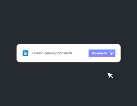 UI App Research Linkedin
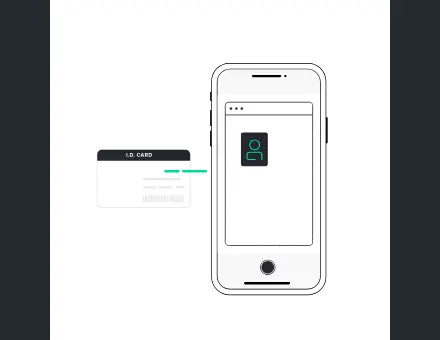 UI App Data ID Card
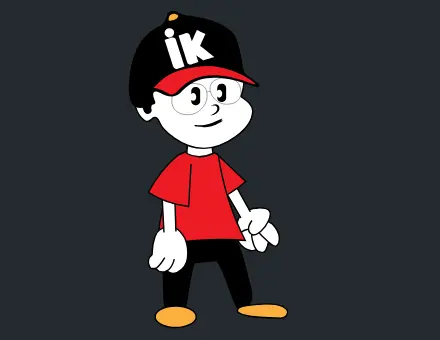 Character Waving Hand
Frequently asked questions
Should every empty state be animated?
No. Use motion when it supports the message and fits the product context. Clear text and a relevant action may be sufficient, particularly for recovery states or screens people revisit frequently. A static design is a valid outcome of the brief.
Can the same illustration serve no data and no results?
Possibly, but the text and action need to distinguish those conditions. No data may require creating or importing something; no results may require changing a filter. Do not let a shared illustration erase that difference.
Are these studio examples finished empty-state projects?
They are original portfolio animations used as visual references. This guide does not claim that each asset was commissioned as an empty state or connect it to an unverified client outcome. A custom implementation needs its own product brief.
Should the CTA wait until the animation finishes?
Usually the interface should make the relevant action available immediately. Agree how motion behaves if the person acts during playback. Do not make a decorative sequence a required step before the user can continue.
What should happen when real content arrives?
Replace the empty-state explanation with the real content according to the application state. Define whether the visual exits, stops or disappears directly. Test fast and slower responses so playback does not delay or contradict an available result.
What do I send for a custom empty-state quote?
Send the screen, known empty conditions, permissions, approved copy and CTA, brand assets, runtime and target sizes. List the number of distinct states and whether illustration design or integration support is required.