PRACTICAL ANIMATION GUIDE / 2026
Accessible Lottie Animation: Reduced Motion, Controls and Alternatives
Accessible Lottie starts with the purpose of the animation and the behavior of the surrounding interface. Keep essential information available without movement, define a reduced-motion alternative, provide appropriate controls and test the implementation with keyboard and assistive technology. A JSON file or a player setting alone cannot certify accessibility. The acceptance checklist must cover the page or app in which the motion appears.
1. Classify decorative and informative motion
Ask what information disappears if the animation is removed. If the same meaning is already expressed by a heading, status message and ordinary controls, the moving illustration may be decorative. If a sequence explains a process that is otherwise absent, it carries information. An interactive animation may also act as a control. These are different responsibilities, even if the underlying artwork looks similar.
Write the purpose next to each component in the brief. A connection icon beside “Account connected” has a different role from an unlabelled icon that is the only indication of success. A sound-wave loader beside readable waiting text is different from a waveform displaying information someone must interpret. Do not infer the accessibility treatment from the filename or from the visual style alone.
For every meaningful state, identify where its text equivalent lives and who maintains it. Keep product status in the application rather than relying on a moving shape to communicate completion or failure. When the status changes dynamically, the developer should evaluate the appropriate announcement behavior. W3C describes a role="status" region as one technique for presenting status updates without moving focus; see ARIA22.
| Role in the interface | Question to resolve | Evidence to include in review |
|---|---|---|
| Decorative illustration | Is the same message available elsewhere? | Screen with the visual hidden |
| Informative sequence | Where is the equivalent explanation? | Text alternative reviewed with the sequence |
| Product status | How does the app report the actual event? | Waiting, success and error states |
| Interactive control | What are its name, state and keyboard actions? | Keyboard and assistive-technology review |
| Repeating background | Can people avoid distracting movement? | Playback policy and motion alternative |
2. Design a useful reduced-motion state
A reduced-motion design should preserve the task. Decide which still frame or simpler transition communicates the relevant information. Stopping at the first exported frame may produce a blank canvas or an unfinished composition, so the frame needs deliberate selection. Include it in design review and in the delivery manifest. The fallback should not require a developer to guess which instant represents the intended result.
The operating-system preference can be detected through prefers-reduced-motion on the web. That preference does not define a particular Lottie frame or automatically solve every interaction. The application needs a policy for what to load and how to behave. The web.dev reference explains detection; use the product brief to define the visual alternative and verify that controls still work.
Consider both initial preference and a preference changed while the page is open if the application supports that response. Test the route into the component as well as a full reload. Keep useful status changes visible even when decorative motion is removed. Reduced movement should not hide the fact that a request completed or leave the visitor permanently looking at a waiting illustration.
Review alternatives on a real layout. An illustration that looks good as a standalone poster may become too detailed at the size of a small confirmation message. A meaningful static icon and short text can be clearer than a freeze-frame containing several overlapping objects. The acceptance criterion is an understandable, usable interface, not visual identity with every frame of the animated version.
3. Provide the controls the context requires
W3C’s Pause, Stop, Hide criterion addresses automatically starting moving content that lasts more than five seconds and appears alongside other content, with an essential-activity exception. Check the complete criterion for the relevant context rather than assuming that every loop is exempt because it is decorative. A pause, stop or hide mechanism may be required. See WCAG 2.2.2.
Separate that requirement from motion triggered by interaction. W3C’s Animation from Interactions criterion is Level AAA and addresses disabling non-essential motion animation triggered by interaction. It is not the same criterion as an automatically playing loop. Keep the distinction clear in a delivery checklist and agree the accessibility target for the project. See WCAG 2.3.3.
Where controls are provided, make their behavior understandable. A button labelled “Pause animation” should pause the intended visual and reflect the resulting state. It should not silently pause a different player elsewhere on the page. If several animations share one global motion setting, explain its scope. Test whether the person can find the control and continue reading without losing their place.
Use ordinary accessible interface controls around the player when appropriate. The Lottie artwork can reflect the control’s state, while the application handles focus and input. A visual toggle is not a complete accessible switch simply because it moves between two appearances. The developer and designer should agree names, states, keyboard behavior and the static alternative before finalizing the interaction.
4. Keep labels and status outside the animation
Do not make color the only way to distinguish an important outcome. Pair a color treatment with readable text or another meaningful cue in the actual interface. W3C’s Use of Color criterion explains why color alone should not convey information or indicate an action. See WCAG 1.4.1. Recoloring an asset to match a brand is a reason to repeat this check, not evidence that it passes.
Review the connection, payment-success and loader references below with that distinction in mind. They are original visual examples, not certified accessible components. An informative payment result still needs accurate application text. A loader still needs a state model and an explanation of the wait. A connection icon used as a button needs a real control around it. The same preview can support several implementations with different accessibility responsibilities.
Keep content that must be translated, selected or updated with product state in normal interface elements where possible. This makes ownership clearer and avoids treating the animation timeline as a content-management system. Document any meaningful text embedded in the artwork and review how the target runtime exposes or duplicates it. The chosen format does not remove the need to test the resulting experience.
5. Test keyboard and assistive-technology behavior
Begin with a manual task walkthrough. Navigate to the component without a pointer, operate any controls, identify the current state and continue to the next action. Then review the experience with representative assistive technology in the target environment. Record the browser or operating system, player version, device and findings. A checked box saying “accessible” without context is not a useful handoff artifact.
Use automated checks to catch issues they can detect, but do not treat a clean scan as proof that the motion is understandable or comfortable. A scanner cannot decide whether an approved final frame communicates the right product meaning. Combine automated results with the state-by-state manual review and the product team’s acceptance criteria. Assign each unresolved issue to the appropriate design or implementation owner.
Test failure and interruption as well as normal playback. The animation asset might not arrive; the visitor might leave the route; a request could complete while motion is paused. The application should continue to communicate its real state. Include the fallback image and behavior in the delivery package so these conditions do not depend on an improvised last-minute fix.
For a scoped implementation review, send the actual screen, player, target platforms, interaction model and current alternative behavior. Start with web animation design, then use the handoff checklist to document acceptance. Accessibility is part of the project scope and verification process, not a badge automatically attached to every exported animation.
ORIGINAL PORTFOLIO REFERENCES
See the motion behind the decisions.
Preview these real studio assets to discuss visual direction. Portfolio access does not grant a reuse licence for commissioned work.
 Icon Connect
 App Illustration Payment Success
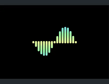 App Loader Sound Wave
Frequently asked questions
Is a Lottie file automatically accessible?
No. Accessibility depends on what the animation communicates and how the interface implements labels, controls, alternatives and state changes. Evaluate the finished page or app. A valid file does not establish that the surrounding experience is accessible.
Does reduced motion always mean hiding the animation?
No. A useful still or a simpler treatment may preserve the same information. Choose the alternative intentionally and keep all required actions available. Hiding essential information together with movement would undermine the purpose of the alternative.
Does every animated icon need a pause button?
The requirement depends on the behavior and context. Evaluate the relevant WCAG criteria, including whether motion starts automatically, its duration and whether it is essential. A brief interaction and a continuous background loop are different cases.
Can I rely on a successful accessibility scan?
Use it as one source of evidence. Manual review is still needed for meaning, motion alternatives, focus, keyboard behavior and representative assistive technology. Record both automated findings and task-based observations in the acceptance checklist.
Are the studio previews accessibility-certified?
No. They are original visual references. Their eventual use may be decorative, informative or interactive, and each context needs its own implementation and checks. A portfolio preview does not certify a client’s future component.
What should be included in the accessibility handoff?
Include the visual’s role, meaningful states, text equivalents, reduced-motion treatment, playback controls, fallback and test context. Identify the design and development owners for each requirement and record unresolved issues before acceptance.